Joostrap templates use optimised Bootstrap layouts within Joomla – the Joostrap templates provide the easiest, fastest and most powerful way to build your website … SEO optimised and mobile friendly.
Below you will find some information about leveraging Joostrap’s implementation of Bootstrap into Joomla.
Bootstrap is the most popular HTML, CSS, and JS framework for developing responsive, mobile first projects on the web.
Boostrap Responsive Inifinite Layouts

One framework, every device.
Bootstrap easily and efficiently scales your websites and applications with a single code base, from phones to tablets to desktops with CSS media queries.

Full of features
With Bootstrap, you get extensive and beautiful documentation for common HTML elements, dozens of custom HTML and CSS components, and awesome jQuery plugins.
Bootstrap grid
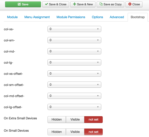
Joostrap makes it SUPER EASY to control the Bootstrap classes on your modules – with our included Bootstrap Params plugin to control your modules.
The picture shows just how easy it is through simple pull down options in your module settings.
Use INFINITE modules in any module position, with bootstrap classes to control it’s size and layout … no need for tens of modules positions anymore !!!
You can find below some basic grid layouts to get you familiar with building within the Bootstrap grid system.

Three equal columns
Get three equal-width columns starting at desktops and scaling to large desktops. On mobile devices, tablets and below, the columns will automatically stack.
Three unequal columns
Get three columns starting at desktops and scaling to large desktops of various widths. Remember, grid columns should add up to twelve for a single horizontal block. More than that, and columns start stacking no matter the viewport.
Two columns
Get two columns starting at desktops and scaling to large desktops.
Full width, single column
No grid classes are necessary for full-width elements.
Two columns with two nested columns
Per the documentation, nesting is easy—just put a row of columns within an existing column. This gives you two columns starting at desktops and scaling to large desktops, with another two (equal widths) within the larger column.
At mobile device sizes, tablets and down, these columns and their nested columns will stack.
Mixed: mobile and desktop
The Bootstrap 3 grid system has four tiers of classes: xs (phones), sm (tablets), md (desktops), and lg (larger desktops). You can use nearly any combination of these classes to create more dynamic and flexible layouts.
Each tier of classes scales up, meaning if you plan on setting the same widths for xs and sm, you only need to specify xs.
Mixed: mobile, tablet, and desktop
Column clearing
Clear floats at specific breakpoints to prevent awkward wrapping with uneven content.
Resize your viewport or check it out on your phone for an example.
Offset, push, and pull resets
Reset offsets, pushes, and pulls at specific breakpoints.